
With all the careful decisions that go into creating a Cube in order to craft a certain experience, there are cards that aren't listed that your players are also going to encounter: Plains, Island, Swamp, Mountain, and Forest. Due to the nature of Cubes, most Cubes are pre-sleeved, which requires pre-sleeving and providing the basic lands that would used for your players' eventual draft decks. Why not also put some thought into which lands your players are going to use?
Land's Beginning
If you don't know what Archfrenemies is, visit the Archfrenemies page for more info.For Archfrenemies, I didn't want to just throw in the full-art Unstable lands, as beautiful as they are. Cubes can be products of intense labors of love, which is surely a fitting place to use some of the most precious of selections of basic lands. However, as my approach to Archfrenemies is to maximize its themes, this meant looking toward basic lands across the board.
Because Archfrenemies features enemy color pairings, I wanted that to show up in the art. Show me Plains with lots of black. Give me Islands with red hues. I want to see Swamps going green. And so on.
On another hand, I also wanted to, if possible, have basic land art with sneaky references to the mechanical themes of Archfrenemies. What land screams "Archenemy?" And what evokes any of extort, surge, morbid, battalion, or graft?
Lastly, because each color has two different enemy colors to form two different enemy color pairings, I had to make a choice. Do I choose a Forest with blue colors or an Island with blue colors? I decided to do both. This meant picking two pieces of art for each basic land and including multiple copies of lands for each of these arts. This way, players that like doing so can at least have a bit of aesthetics choice - and we can all enjoy twice as much art!
Plains
 |
| Plains by Florian de Gesincourt |
 |
| Plains by Mark Poole |
The sun is setting on this Plains, which gives that red coloring that evokes the Boros theme present in Archfrenemies. Dusk means darkness drawing near for the team-based battalion players, symbolism of what little time left our heroes have before one or both of the two Thanoses fulfill a grim destiny.
Island
 |
| Island by Lucas Graciano |
Red water (read: blood) from Hour of Devastation is one way to ensure there are red hues present in an Island. Also, things aren't looking good for this Island of what might be a blue-red player, who might be using surge, a mechanic that benefits most when played as part of a team. Mwahahaha.
An important note about using basic land art from the Amonkhet block: as Archfrenemies doesn't have anything to do with Nicol Bolas, and given that Archenemy: Nicol Bolas is an existing product, I wanted to be sure to veer away from any imagery that gives players any sense that there's Nicol present in this format. Thus, basic land art with strong depiction of Bolas horns need not apply.
An important note about using basic land art from the Amonkhet block: as Archfrenemies doesn't have anything to do with Nicol Bolas, and given that Archenemy: Nicol Bolas is an existing product, I wanted to be sure to veer away from any imagery that gives players any sense that there's Nicol present in this format. Thus, basic land art with strong depiction of Bolas horns need not apply.
 |
| Island by Kev Walker |
One thing I scanned for while looking through basic land art was how sharp were the hues of the enemy pairing color I could find. This Island was chosen because it was one of the best ones to show off "GREEN" in the art. That is all.
NOTE: Mark Poole's green-covered Alpha Island is suredly very green. However, since I wanted to ensure all my basic lands have the modern card frame and are black-bordered, this meant there were no eligible printings using that art. Besides, Mark Poole art already shows up in TWO other slots for basic land art!
Swamp
 |
| Swamp by Jung Park |
For the green-hinted Swamp, I wanted to find one with both a cemetery to give that wink toward morbid. While some locales depicted in Swamps can be argued to be cemeteries without headstones present in it, these real-world-relatable grave monuments really do great work at communicating visually, "Hey, there's death here." Unfortunately, this is the greenest Swamp I could find meeting this need, of which the green is difficult to see, especially at card size.
 |
| Swamp by Jonas De Ro |
Thanks, Dominaria! While the Plains I chose gives that sense of "Hey, this might be where the bad guy is," this Swamp definitely communicates, "OKAY, THIS IS DEFINITELY WHERE THE BAD GUY LIVES." Also, the coloring of that light is white, for the most part!
Mountain
 |
| Mountain by Karl Kopinski |
This is the white-hinted Mountain. Take a close look at the dark-colored mountainous terrain. You'll notice there are people standing on it. How many people? Three. And how many are on a team in Archfrenemies and is the required number for triggering battalion? That's right - three. This is the perfect Archfrenemies Mountain.
BONUS: This is also the sole Mountain used for the Tuktuk the Explorer Commander deck since there was a requirement to only include cards with art depicting a torch. ...one of these three people is holding up an arm with an orange glow emanating from it. Torch!
 |
| Mountain by Titus Lunter |
(Sorry for the low-res pic! Hard to find high-res images of sets that haven't been released, yet.)
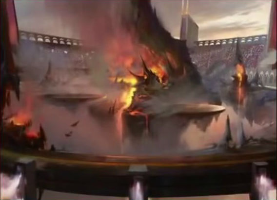
So, I had a different Mountain in mind for the red-blue-ish one. Until Battlebond released the image of its Mountain. This was perfect for two reason:
1) It's very clearly Battlebond, a set that can be identified with the term "teammate," which is what's going on with Archfrenemies with the surge mechanic mentioning "teammate."
2) That oozing lava coming out of these mountainous territory can be said to be surging out of them. Eh? Yeah? 'kay, that's all.
With Battlebond releasing June 8th and Card Kingdom's super-fast shipping - I should be able to get my updated Mountains in time before bringing the Archfrenemies Cube to GP Vegas!
Forest
 |
| Forest by Mark Poole |
A second Mark Poole art used in the basic lands! For this one, the blue sky means "the sky's the limit" in terms of how far you can grow/reach - for graft! And that sky is quite blue.
 |
| Forest by James Paick |
Boy, for a Forest, there's very little green going on in this art.
I knew that spooky/gloomy Forests from either of the Innistrad blocks was going to be the likely choice. Some of them had glimmers of life in the form of a stream or hopefully-colored leaves.
Nah, we needed darkness and none of that bright, happy stuff. Like, those are branches without leaves, and who knows how long of a fall it is if you trip over those logs into the misty area?
Ten out of Ten, Basically
And that's it for basic land art! Thanks for reading my thoughts on why I picked the ones I did. But maybe you have some better suggestions for basic lands! Give me a tweet (@bradleyrose) if so.
Below are all of the cards, when viewed together, in card form:
Below are all of the cards, when viewed together, in card form:


No comments:
Post a Comment